Wednesday 30 November 2011

M2 Ch 10 Stab stitch book part 2

It was fun making the butterfly and rainbow book but think this one is my favourite.  I like the messiness of it all.  It has a very different mood and therefore colour palete.  I did plan to make each page the same size as the front page photo but somehow it just didn't work that way when started making them.  Some pages are fairly plain but I felt each pair of pages complemented each other.  This time the haiku is on the front cover.  This photo is one I took years ago but seemed just right for this book even though it was taken in the middle of the day with lots of people about, I just struck lucky.


The black page was made by rubbing over PVA writing.  I've found some little bottles since the PVA chapter but think I was just as happy writing straight out of the bottle.


The left hand page started of as writing using ink and dropper but it just soaked into the paper leaving a big black blob.  The writing was then done with a pastel and rubbed.


I had another go at Jasper John letters with much more limited colour.  I wasn't sure at first but the white addition when the rest was dry made a difference.


The background for the left hand side was supposed to be wax resist but the paint didn't resist so I added extra wax when it had dried.  It's amazing how some things just don't work as expected.  I really like the woven page but I always enjoy weaving.


I found the collage button on Picassa so had to give it a go.  The background is a bit big, think I'll add some silver border lines.  I love the atmospheric photo on the other page, shame it isn't one of mine!


This time I used clean paper for writing with ink and dropper and added crayon later.  How useful newspaper print is for black and white pages!  Again it took a lot of searching to find the right letters, some letters are easier than others. 


This thin strips on this woven page are silver but don't show up on the blog.  The wax resist worked this time though.  (The back page isn't worth showing, it's more PVA and wax resist on thin white paper.)

M2 Ch10 Making Sketchbooks

2.10.1  Making trial sketchbooks  I decided to use papers I'd made earlier which I felt would cut down to make little books in their own right.  Only one was made by folding the papers as I've made lots of books in the past using this method but hadn't made stab stitch books before and really liked this style.


2.10.2  Stab stitch books using letters as a theme.  I decided to use a haiku poem for this exercise but when I looked for one I liked I found two, both very different, so decided to make 2 books.  The second one is in another blog.
The first one is about butterflies and rainbows so suggested very bright colours, somehow the indigo didn't quite get there!  The butterflies are sewn because I was missing my sewing machine.  The red pages are using Klimt patterns.  Looking at the page I think maybe most of the black should have been red to keep the rainbow colours.


I was very pleased with this page and feel it really evokes bright butterflies.  I was worried when the inks started spreading on the yellow silk paper but it stopped just in time.

 It took ages finding all the letters in colours which were suitable but think it was worth it.  The butterfly is only stuck down the middle so it can stand out.

I was a bit worried this green page would look a bit childish, if it does I don't think it matters.


The blue butterfly has been concertinaed (is this a word?) but doesn't show on the blog.  The background is the clingfilm I used to dry the blue silk paper page. 


This page is a bit more indigo like.  I decided to leave the haiku in full until last.  It's written in rainbow ink but doesn't show up too well here.  Can't remember if I did or not but if I didn't I should have done it in bold.

Monday 14 November 2011

M2 Ch 9 Letters and Pattern

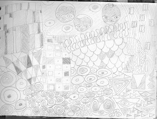
2.9.1. Draw patterns that Klimt used in his work.  I used pens for this exercise which maybe cheating a bit but gave neat lines. It's a very relaxing activity.


The page above was drawn using a gold pen, the one below with a pencil.


2.9.2. Make an illuminated letter in the style of Klimt. Poppy and I did the first 2 pages together using 'Granny's special pens.'  It's a shame the colours didn't scan more vibrantly.


The R was painted first with water colour (it is a brighter orange), I wish I had painted the white too, just to give some texture, then I used felt tips.


The background was acrylic painted then patterns drawn with black felt tip.  The R was collaged with papers found in magazines.  I'm not sure the colours are right but I actually quite like the result.

M2 Ch 8 Addition

Here's my first alphabet the right way up!

M2 Ch 8 Using Your Camera


Been busy again, looking after Poppy while her Mum was even busier giving birth to these two, Iris and Grace on Nov 4th.  Here they are a day old, they already look much prettier.  They're settling down very well and Helen and Simon are even getting some sleep!


2.8.1. Making an alphabet.  I've been collecting photos since the beginning of May, roping in friends and family to help so it's been great fun.  I also made some of my own rules and 2 alphabets.  One is of different letters found in the environment.  I planned to find them in different places but ended up with several from gravestones as I really liked them and they are very different fonts.  Just realised it's upside down and can't work out how to either delete the photo or add another one so will try another blog.


The other alphabet didn't have any found letters but shapes found in the environment.  I decided I wasn't allowed to alter anything but the letters had to be exactly as found.  I almost cheated with the z, making z-shapes with leaves and pine needles and then found the tree root, it was dusk by then so the photo isn't as clear as it could be.  The object also had to be they way round it was, no turning photos upsidedown or back to front.  All photos were taken outside too, even the cup of tea we were drinking at an outside cafe.

I felt the photos needed a border to show up but then tried again making the border narrower.  I tried to work out how to stretch a photo (eg the m) but couldn't find a way but I am still quite pleased with the result.

Wednesday 12 October 2011

M2 Ch7 Jasper Johns

2.7.1 Finding out about Jasper Johns.  I found the more you looked at Jasper Johns work the more depth and colour was there. Below are a few thoughts.


2.7.2  I decided to use the last letters of the Greek alphabet for this exercise.  This was partly because I wanted to see if by using unfamiliar letters they were still clear despite the 'splodgy' paint and they are. The omega is less clear on the left hand side but that's the colours I used.  I did find I was using more and more paint and adding more streaks which gave pleasing effects.  Also with the white, I realised the white does in fact reflect the underneath colour and too white a white didn't look right.  It was a bit of a challenge for me using such bright colours but I did enjoy the exercise.


Wednesday 5 October 2011

M2 Ch6 Printing part 2

A continuation of what I started earlier.

This is one of my texture paste pieces of paper without extra paint added before printing.  I think it is one of the more interesting pieces in this chapter.


The second doilley, think I need to rethink doilleys, maybe rip them up and fold.


This is using one of my machine sewn pages, even the printing has made the stitching show up more.  I've painted another page but not used it here and that helped it too.


Painting and printing then closing the page when still wet, acrylic paint is probably not the best paint for this as it dries so quickly, maybe have to treat myself to some gauche.


deColourant plus on fabric, much bolder results on plain fabrics but again hasn't really taken out the old colour except on the plain brown.  Not sure it matters though, although it would have looked good with the red on the black and gold.

M2 Ch 6 Printing

2.6.1 Making letter printing blocks

I started this chapter with my granddaughter who loves having a go at things I'm doing on my course. We made an m and p together and used some wooden blocks to print as well.  She couldn't understand why I printed some of letters the wrong way round.
Later I made more letters on my own, a fairly random collection.


2.6.2 Using letter printing blocks

I started just playing with the letters I'd made, wooden ones and stamp pads.  Hence the rather Christmassy colours!  I liked the negative letters but somehow wasn't inspired to use them later.  Somehow the next 2 pages are upside down but guess that doesn't matter.


This page was done experimenting with 'stuff' I found while in the US, (a huge quilt shop)  It was supposed to take out the old dye and replace with the new colour.  This had an ink background and it's still there but I really like the way it shows through the new colour.


From now on I used acrylic paint to print.This is just a random page in my sketchbook, one minute I quite like it, then I think it's a mess, obviously needs further work.


Contrasting pages


I've been waiting to use these pages for a while and am really pleased with the way it has turned out but I always like weaving.


Must have had a doilley moment, there are two of them I realised afterwards, very similiar.


I added paint and letters to my money page but looking at the photo still need to add something else, possibly some dark paint over the existing paint would give it more depth.


Added these photos before I downloaded them all and now I can't add any more, will try publishing this and then doing another.

Friday 9 September 2011

M2 Ch5 Recycled Papers

2.5.2 Using glue to make recycled papers.
The 3 newspaper sheets I made from a Finnish newspaper. The one with just strips of newprint looks very plain against the others but a very useful background for printing.  The one with assorted papers also has the plastic sewn on withbean string as I was determined it would be included and it didn't want to stick with PVA.

Weaving.  I used an article about the riots for this exercise and was very pleased with the results -the colours and parts of photos which showed.  The big one, on the left uses irregular widths, the one on the right more or less the same.


The weaving from the back didn't look bad either.


2.5.3 Using stitch.  I was disappointed with the machine stitching, although it's better using the patterns, as they don't show up as much as I'd like, even the red.  The addition of tissue helped too.  However I really liked the hand sewing where I could use thicker threads and bigger stitches. (Here only on sketchbook page)

2.5.4 Adding to the surface.  I found some very old texture paste which was rather dry but it was only after doing several sheets it dawned on me that I could add some water.  Then I got on better.  I could definitely see possibilities here for making interesting papers. 

I used acrylic paint for this exercise and definitely preferred using the thick paint to the liquid acrylic I added to the brown bag.  I really liked the way the paint transformed the tin can making a dark zigzag down the page (unexpectedly).  The yellow page had my husband's size 9s across it when it was drying (he couldn't see bright yellow!?)  Actually I feel it added to the page which didn't have enough print left unpainted and I might have added more gouges if I'd got home before it dried!  The orange one is better as more of the background shows through.


Pages from my sketchbook.  The one on the left has words, stitch and acrylic, the one on the right tissue and raffia.  The other side of the raffia had texture paste added too (see texture page photo)
I feel I've added to my repertoire of making pages more interesting with this chapter, now to remember it all and put into practice .