Monday 30 January 2012

M3 Ch7 Drawing the Landscape

I approached this chapter with trepidation, as with any drawing activity, but wasn't too displeased with the results.
3.7.1  I downloaded several drawings of Van Gogh. Initially I was going to draw the sower as drawing figures is my least favourite drawing subject but decided it really wasn't clear enough to copy satisfactorily.

Although I understand the difference between pencils I still didn't seem to quite know which to use when as both of the softest pencils gave me the lines I wanted depending on the pressure used. 

3.7.2 I printed 2 photos of Newfoundland but decided the way the computer printed the fence had a Van Gogh look about it already and easily showed the 3 elements.   
I think my finished painting looks like a first effort and better from a distance, up close some of the thicker blobs of paint are too thick.  I think the group of buildings and jetty worked best.

Wednesday 25 January 2012

M3. Ch6 Torn Paper Lines

3.6.1 The first photo shows my pages before adding a colour wash.  I liked the subtle patterns the cartridge paper made - white against white. 
It remained my favourite page after I added a quink colourwash too.  I realise now I used blue instead of the planned black but see possibilities for sea and sky patterns.  I especially like the way the ink is drawn to the edges.

The newspaper page had acrylic ink added.  Not so interesting.

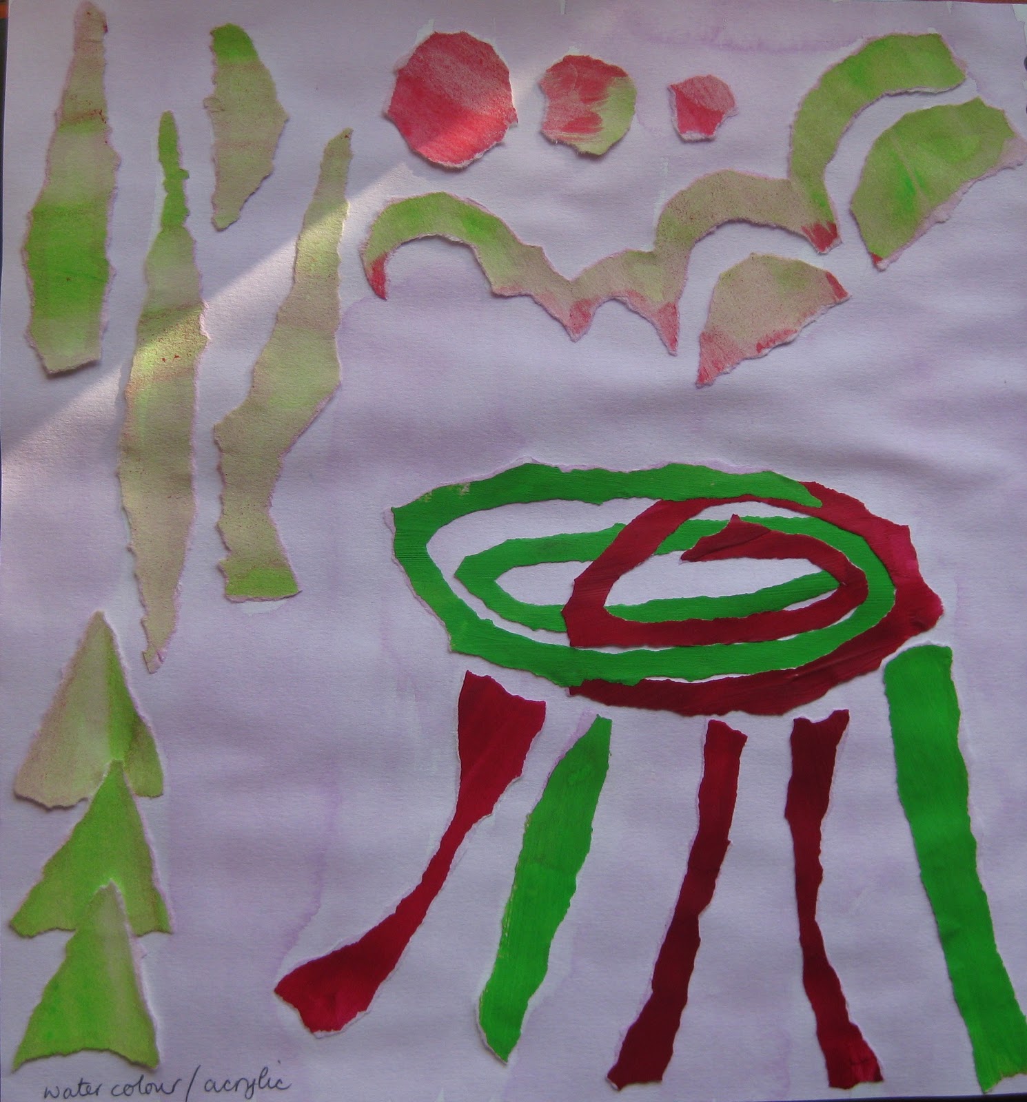
The next page is a mixture of water colour and acrylic paint pieces with a watercolour wash.  Again I like the way the paint is drawn to the edges of the watercolour and subtly changed the colours.  The acrylic just resisted.

My bright magazine pages were colour washed with walnut ink.  On the photo they don't look much different so I've added another, much darker, layer.  The red is still dominant but the rest has receeded .
3.6.2 and 3.6.EA  The first photo shows my preparation for the activity.  That was the easy bit, I found making a picture I was satisfied with very difficult.  Could be partly because I decided to use my paper stash and not create more papers so nothing seemed quite right.  Therefore my series never really materialised as I experimented with colours, something I certainly need to practise more.  All that tearing made my fingeres sore too.

These pictures are actually in the reverse order that I did them.  This is the picture I think worked best, the dominant orange against the browns in the background.
Looking at this and the next picture through a reducing glass I decided they were better with less sky so have chopped the top of the photos for the blog.  The obvious problem with this picture is that there is nothing in the foreground and the orange walls are far too dominant.  Covering the picture definitely improves it so I should have cropped the bottom too.

I think a colour wash might have made the background better although initially I liked the white.  The yellow stands out but it's a bit acidic looking, think it may have been better using the yellows the other way round, cool for the trunk, warm for the leaves.

M3 Ch5 Spaces make lines

3.5.1  I loved this chapter and making patterns, definitely one of my favourites.  I found using circles surprisingly more difficult than squares to get the effect I wanted and irregular shapes even more so.  kept me quiet for ages!  (Not quite sure how the squares got mixed up with the next exercise.)

3.5.2  Again great fun.  It took me a long time to work out how to make a circle and was so obvious as light gradually dawned.
I also thought I'd have a go using magazine papers and spent a long time looking for interesting papers.  The duckings were an irresistible extra.


3.5.EA  The more you look the more naturally occurring lines you see.  I did my stick lines in a bit of a hurry as there were several dogs on the beach looking very interested in what I was doing.


Wednesday 11 January 2012

M3 Ch4 Printed Lines

I enjoyed this chapter very much and hope the time spent playing will encourage me to use more printing in my work.  I liked making my own stamp pads too although the lids on the pots I used didn't stop the ink drying out at all which was disappointing.
A.3.4.1 Trying different tools
This is where the fun begins, all the little pictures.  Shame the green acrylic ink bled through though.  I am also enjoying working in a square book, it's very satisfying getting 4 squares on a page and it just feels nice.  The liney block overlapping sqaure didn't really work but the sponge dauber was really pleasing.


I like the lines the folded card made, very ferny, especially in green.


A.3.4.1  I really had trouble trying to get zigzags that looked like zigzags when printed together but I quite like the results of the bronze one.

This is my favourite page, especially the red folded card square.  The black zigzags worked here too with the lines more distinct from each other.

Thursday 5 January 2012

M3 Ch3 Kandinsky

Wassily Kandinsky (1866-1944)  I was interested to learn that Kandinsky came late to art having first an academic career in law.  Shows there's hope for us all.  The first picture I chose turned out to be someone else's 'in the style of' (I just noticed the signature in time after I printed the picture) which is why I didn't need all my painted papers.  I did plan to take a photo before adding the black lines as I felt they would make a big difference but I forgot and they did.  It was the wavy line which really attracted me to the original painting.  Is there a trick to painting a tidy black line with thick acrylic or is it just practice?


M3 ch2 Creating movement with line

A3.2.1 I really enjoyed doing these, especially the curvy ones - except for the wave (9) which wasn't very satisfactory even on the third try.  The wavy lines same width apart (3) really moved and made my eyes swim.  The lines round dots was my favourite which meant I used the same idea for A3.2.2 so I don't feel I was very imaginative for that exercise but it was fun.


A.3.2.2 The snails all curled up asleep is my favourite!  I liked the colours too

M3 Ch1 Walking the Line

A3.1.1 Making lines using different tools and methods. I'm sure i could have carried on doing lots more pages but here is what I did do.  It's amazing how many bits and bobs i have accumulated mostly in my workroom.


A.3.1.2 I enjoyed this activity but the matches did like falling in a lump so I started dropping them in 2 lots from different directions.

I do like my fountain pen and really should use it more, it's just lazy when there are so many alternatives.  It's a bit more tricky drawing outlines, remembering not to cross the lines.


E.A. It took a long time to get the pebbles to drop in a pattern I liked and then each time I drew them they came out differently, partly because I saw different markings, partly because I wanted to fill up the rectangle more.  I did draw quickly. The bottom 3 are the same arrangement upsidedown.


The tracing pages which were just laid and then photographed using a flash have a much more ethereal look and I like this much better.  The edges of the tracing paper don't show up either.


A.3.1.3 Moods