Tuesday, 19 February 2013

M5 Ch7 Bodies and Movement

A5.7.1/2 Body proportions and articulated figures. I enjoyed making my 'man' then increased the size and made a bigger man with the idea of making big pictures.


A5.7.3 Poses.  The drawn figures reminded me of rock paintings and ghosts and a good excuse to use colours I love.  Picture 1 Dancing. Water colours.

Picture 2 Jumping.  Dye based paints and printing ink.

Picture 3 Ghosts. Woven background and tissue figures

Picture 4 Yoga- Tree. Acrylic background, paper bag figures with walnut ink.  I made a lovely background (seen at the top) and the figures looked good in the bag colour.  I then decide to screw them up (which I liked) and wash with walnut ink so the ink ran into the cracks.  However the ink was too dark so the figures didn't show on the background so I had to make another.
 
Picture 5. Left over figures from the last picture, arms and legs woven to make a muddle.

Picture 6. Fragments of the Past.  Following on from cutting up my mask picture.
 

 I thought this looked a lovely thing to do with children, so tried it out with Poppy, and it was a great success. She decided on a collage background and to make 'proper' people using felt tips.  We blu-tacked the figures on the paper so she could draw round them without help.  It was a great exercise in body awareness for both of us and how you actually do something.  She was a very ready model to demonstrate cartwheels and head over heels.  We even got Mum draw a man although Poppy couldn't understand not giving them hair and faces.  May need to show her some famous artists who haven't either.


Monday, 11 February 2013

M5 Ch6 Changing Faces

A5.6.1.  Scrapbook.  This could have gone on as I thought of different 'Changing Faces.'  Photo 1 came from pictures, books and leaflets I had, and a mask bought from South Africa.  Photo 2 is images downloaded from the Internet.  Photos 3 and 4 were from a website, Masks from Around the World.  This was a great website, my 4 year old grandson and I spent a happy hour looking at it which may have some bearing on the choice of images and the number!


A5.6.2.  I chose 3 different masks to draw and, much as my natural inclination was to choose an African mask, I chose a Chinese opera mask to develop.  I was attracted by the 'eye mask'.  I also chose primary colours as best suited the graphic design, again not colours I would naturally choose - and certainly not to wear.
Last things first!  My collection of pictures is different sizes so I chose to make a folder with different size pockets.  The first 2 pictures show the inside and outside of the folder with pictures added.


Here are the 3 masks I chose, one Chinese, one Indian and one African.  It was tempting to print the pictures and trace them but I resisted although I did then copy my drawings.  The Chinese one proved most difficult as I got in a muddle with the swirls above the eyes, a coloured in version helped in subsequent pictures.  Using felt tips was a lovely relaxing exercise.

Despite the smudges I liked the charcoal copy and spray stopped it getting worse.

Thought I'd try blue and yellow and swap the colours round.  Yellow was like the original, blue seemed to like the black.


 My favourite part was the 'mask' round the eyes so took this further, taking out the eyes so it was just a pattern and tried different colourways.  I made a stencil to help here, drawing round the pattern.  The black and white appealed so that was another development.  Strangely, the off white paper stayed off white even when painted so I didn't bother.  Acrylic paint worked best giving the boldest colour.


More stencils, three to show different lines of the mask but this time I sponged the paint directly through the stencil.  The covers were made using one stencil on top of another,something I hadn't done before but it was easier than I expected and worked well.  Then just white on black.


Using stencils again but this time to make paper cutouts, the white on black is my favourite.


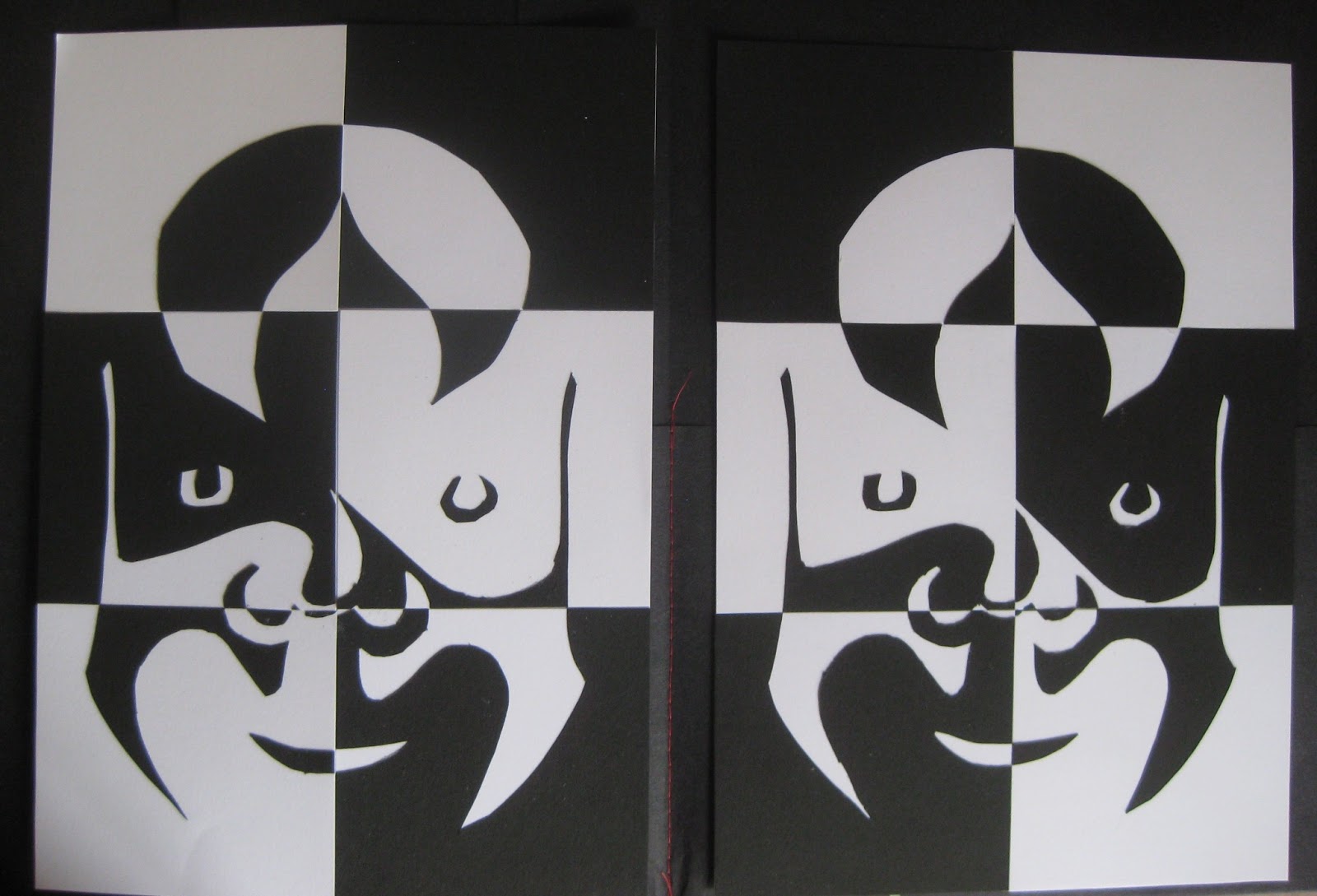
Paper cutouts make two similar pictures so I chopped two to make a chequer board.  from a distance the faces seem to disappear, leading on to another idea.


This time I sponge printed onto fabric using fabric paints and decided to liven them up with stitch.  For the first one I used thick thread in the bobbin.  (If this piece was for an exhibition I would need to check the tension more carefully.  I quite like the bobbly effect but not mixed with the smoother bits!)  For the second piece I used stitch to make the pieces become one again.  I wasn't sure when I first stuck the bits back together but adding stitches made a big difference and I was pleased with the end result.  I also learnt a couple of things - iron set one colour before adding the next as they will mix, being lazy and using a towel instead of getting out the ironing board will crinkle fabric when applying bondaweb.  

.

Sunday, 20 January 2013

M5 Ch5 Colourful Faces

A.5.5.1. Adding Colour.  For this exercise I used water colour first and then pastels.  I think the water colour worked better, I look as if I have a beard in the pastel one.  Not sure how to lighten the neck without making it worse, it was, of course, in shadow.


 Extra Activity.  I already had Picassa on my computer but hadn't used it to change colour, I mostly use it to straighten horizons.  I used it on both pictures and had great fun.  Some look quite spooky, eg no. 3 pink with yellow eyes.  Photo 4 looks as if I've used a scrapper board.  Photo 7 is my favourite (apart from the neck)


 A.5.5.2. Adding Stitch.  I used this activity to kill 2 birds with one stone.  I had got very behind with my journal quilts with contemporary quilters so decided if I stitched me in blue that would fulfil all criteria.  I like the dark blue stitch best, think my eyes look a bit scary when done in pale blue.  I added a bit of Markel highlight with the pale stitch too and can't quite decide if I think it improves it and whether to add some to the dark stitch too.


A5.5.1. Adding colour

Monday, 7 January 2013

M5 Ch4 Your Own Face

A5.4.1. Touch Drawing. I find I am approaching each activity in this module with a 'go for it' attitude being not that confident at drawing.  Dithering doesn't help.  This is very evident in this activity!  It at first seemed impossible but the second go shows that you can do better so if I did 100 drawings it might not be too bad. 


A5.4.2. Continuous Line Drawing.  This was really tricky but, like the last one, good fun if not taken too seriously. 


A.5.4.3. Observed self-portrait drawing.  Good job Viv doesn't know what I look like, I could pretend it's a good likeness.  I decided to put my glasses on as they gave a good marker when looking in the mirror.  The only trouble with that is that I'm looking down which makes me a bit more jowly than I am.  My husband reckons my nose is a bit wide too.  Anyway, I'm generally quite happy with the result as a first try ever.

M5 Ch3 Artists Self Portraits

A5.3.1. Again it seemed a bit unnecessary to print lots of photos when the quality is so much better when seen on the computer.  My favourite sites were the National Portrait Gallery (especially the teachers bit) and Charleston Farmhouse which is one of my favourite places to visit.


A.5.3.2. Poor Rossetti!  He has lost his handsome features. I wish I'd used sepia coloured paper as Rossetti did (or painted it first) as that would have been easier.  For some reason the white pastel does not show up either.  Still, I've had a go.


Pencil and pastel, drawn in 1847.


M5 Ch2 Hands and Eyes

A5.2.1  My hand drawing came out better than I expected.  Of course, drawing round my hand was an easy start!


A5.2.2. The curled hand came out a bit fat.  Looking at it again I think the far line should have come down at a steeper angle, but I'm generally quite happy with the result.


Better proportions this time.


A.5.2.3. A bit of light relief.  And those wretched doilies again, I must have been feeling a bit festive.


A.5.2.4. I found paintings on several websites but when I printed them they were very pixelated.  But still the web is a good source.  I tried to find a good selection including The Scream which is not true representation but shows emotion.  So many paintings have the eyes looking at you, it's Mona Lisa that follows you.


A.5.2.5. I dreaded having to commit my 'Marty Feldman' eyes to paper but, nevertheless, set to and did it.  I think I got a bit better each time but only slightly and probably wishful thinking!