Monday, 25 March 2013

M5 Ch10 Degas and Pastels

A5.10.1. Mark making with pastels. I already had oil pastels so treated myself to some soft pastels.  There was a great difference in the cost of the different makes so I decided to try different ones to discover why.  Although called soft pastels, they seemed to behave more like Viv's description of hard pastels.  I did like the Sennelier ones (despite getting some on the carpet which I have been unable to remove)  Different colours had a different consistency so needed treating differently, a bit like children.  The colours were beautiful.
I started with my familiar oil pastels...


...moved onto the Daler- Rowney...

and then the Sennelier.

I then found some Faber-Castell ones in a monochrome box I have and tried those.

I tried different papers too - cartridge, water colour, tissue, paper napkin, brown paper but my favourite was black because it made the colours sing and glow.

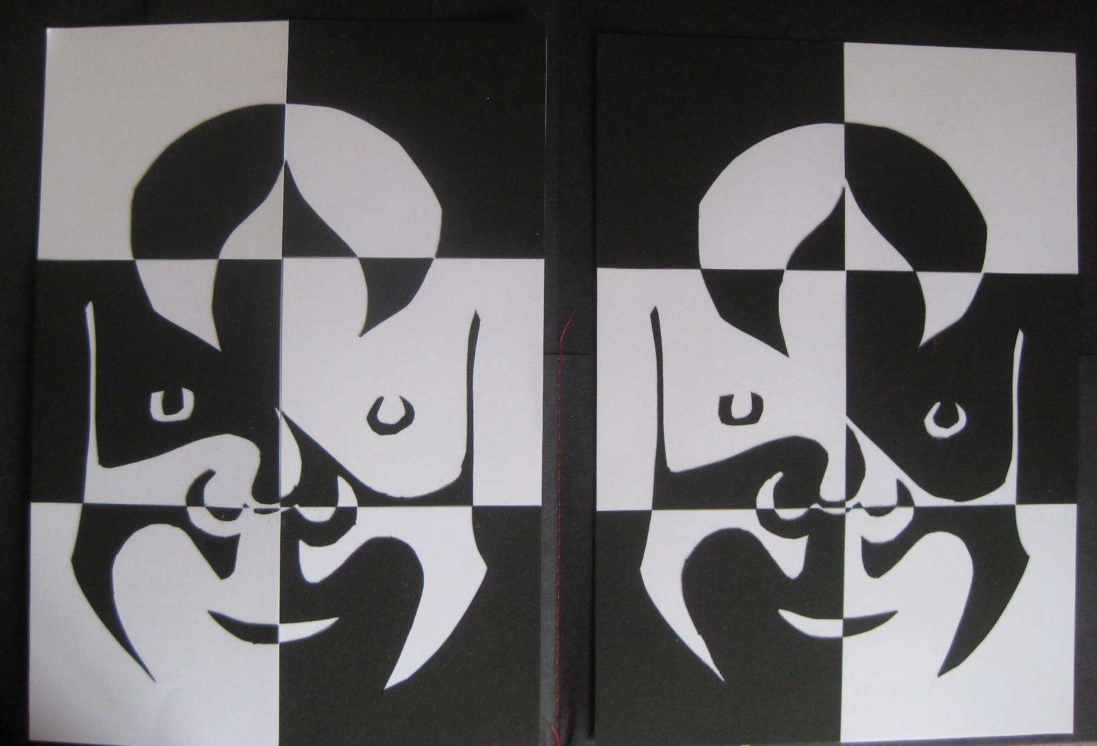
A5.10.2. Using stencils.  I just used Sonnelier pastels and fingers for the rest of the activities as they were my favourites.  I was pleased with the way the leaf pattern came out and like the brown squares.

 I found the torn paper activity wonderfully therapeutic!


A5.10.3 Copying fragments of Degas paintings was more of a challenge than I expected it to be but I think I improved a bit as I tried more and learnt more about the pastels.
be


To finish, here is a photo of all my module 5 work in their folders.  I found I could use some of the experimental folders done in Ch1 and made more for other chapters, especially 'Bodies and Movement' when I made some larger pictures.
It has been another enjoyable module, time consuming and definitely challenging at times - all that drawing- but I also feel I have learnt a lot and become more confident.


Sunday, 17 March 2013

M5 Ch9 Crowds 2

A5.9.1.  Gallery.  Here's a collection of pictures and photos of mine to show different kinds of crowds and different occasions.  It took me ages to do, it's easy when the photos are in the same folder but I wanted to include photos from everywhere.


A5.9.2.  Using stencils and templates.  I decided to go for a Medieval theme after a visit to Berlin and seeing the proverb painting by Pieter Bruegel.  I have always liked his paintings as there is so much going on.  I chose to use the same colours as in the painting.  I picked out 5 of the characters to draw.  Taking them out of context changed what they appeared to be doing as did putting them in different groupings.  That I found really interesting.
 Using the template to cut out figures.  I do like my brown paper bags and I think they work for this.
 Drawing round the template with a wax crayon - one left alone and the other painted with water colour and a pencil crayon with watercolour pencil wash.
 Template and acrylic paint sponged.

I didn't have any printing ink or acrylic paint so decided to buy one tube of each to try.  My local shop only had water based printing ink so I bought a tube of that and a tube of oil paint.  The lady in the shop suggested a tube of (?) to make it better for printing but I declined when I saw the price as I'm only experimenting.  I was glad I did.  This first picture was made using the ink and the stencils which were then rubbed on the paper to make the inverse image.
 A5.9.3.  Monoprinting
Method 1. I tried various media for this but found quick drying ones too quick however small an area I did as the paint had to be thinly spread.  I liked fabric paints best so this is what I have used here.  (The special lightener made the paint to runny, hence the chap with fat legs!)
I then tried my new ink and oil paint.

 Method 2.  Using oil. The top 2 drawings actually worked quite well although they don't show up here. The bottom 2 are oil rubbings after using the template.

 On the computer the ink looks better but certainly doesn't in reality.  This is a mixture of method 2 and rubbings taken afterwards.
 Method 3. I liked this one although again the ink didn't work as well as the oil.  Again a mixture of method 3 and rubbings.  The downside of oil could be the very long drying time.


The laminate when I had finished.


A mixture of templates and stencils - and a rubbing.  Looking at the picture on the computer i think the blue dots should be smaller as they dominate too much so may try again.


Friday, 1 March 2013

M5 Ch8 Crowds

M5 Ch7 A3 I tried more negative figures using different sized templates.  Not sure the contrast in colour is strong enough but there are some interesting shapes.  From a distance the lines almost looked like writing and that gave me another idea but for another day.
A5.8.1 l.S.Lowry.  I found this quite a hard exercise but afterwards realised I needn't have painted the outlines first which is what I found tricky, trying to make the lines thin enough.
 

A5.8.2.  Keith Haring.  I enjoyed drawing these little men and playing with the templates.

I mostly used dye-based paints and loved the way the black outline made them stand out and got rid of all the little wobbles in the painting.  I like the way, too, that the figures can be used to tell a story


Painting the negative shapes was surprisingly difficult.  It would have been easier to paint the background first and then added cut shapes on top.  This might not have made such interesting shapes though.
 I did use cut out figures to stick on the black paper.


Tuesday, 19 February 2013

M5 Ch7 Bodies and Movement

A5.7.1/2 Body proportions and articulated figures. I enjoyed making my 'man' then increased the size and made a bigger man with the idea of making big pictures.


A5.7.3 Poses.  The drawn figures reminded me of rock paintings and ghosts and a good excuse to use colours I love.  Picture 1 Dancing. Water colours.

Picture 2 Jumping.  Dye based paints and printing ink.

Picture 3 Ghosts. Woven background and tissue figures

Picture 4 Yoga- Tree. Acrylic background, paper bag figures with walnut ink.  I made a lovely background (seen at the top) and the figures looked good in the bag colour.  I then decide to screw them up (which I liked) and wash with walnut ink so the ink ran into the cracks.  However the ink was too dark so the figures didn't show on the background so I had to make another.
 
Picture 5. Left over figures from the last picture, arms and legs woven to make a muddle.

Picture 6. Fragments of the Past.  Following on from cutting up my mask picture.
 

 I thought this looked a lovely thing to do with children, so tried it out with Poppy, and it was a great success. She decided on a collage background and to make 'proper' people using felt tips.  We blu-tacked the figures on the paper so she could draw round them without help.  It was a great exercise in body awareness for both of us and how you actually do something.  She was a very ready model to demonstrate cartwheels and head over heels.  We even got Mum draw a man although Poppy couldn't understand not giving them hair and faces.  May need to show her some famous artists who haven't either.


Monday, 11 February 2013

M5 Ch6 Changing Faces

A5.6.1.  Scrapbook.  This could have gone on as I thought of different 'Changing Faces.'  Photo 1 came from pictures, books and leaflets I had, and a mask bought from South Africa.  Photo 2 is images downloaded from the Internet.  Photos 3 and 4 were from a website, Masks from Around the World.  This was a great website, my 4 year old grandson and I spent a happy hour looking at it which may have some bearing on the choice of images and the number!


A5.6.2.  I chose 3 different masks to draw and, much as my natural inclination was to choose an African mask, I chose a Chinese opera mask to develop.  I was attracted by the 'eye mask'.  I also chose primary colours as best suited the graphic design, again not colours I would naturally choose - and certainly not to wear.
Last things first!  My collection of pictures is different sizes so I chose to make a folder with different size pockets.  The first 2 pictures show the inside and outside of the folder with pictures added.


Here are the 3 masks I chose, one Chinese, one Indian and one African.  It was tempting to print the pictures and trace them but I resisted although I did then copy my drawings.  The Chinese one proved most difficult as I got in a muddle with the swirls above the eyes, a coloured in version helped in subsequent pictures.  Using felt tips was a lovely relaxing exercise.

Despite the smudges I liked the charcoal copy and spray stopped it getting worse.

Thought I'd try blue and yellow and swap the colours round.  Yellow was like the original, blue seemed to like the black.


 My favourite part was the 'mask' round the eyes so took this further, taking out the eyes so it was just a pattern and tried different colourways.  I made a stencil to help here, drawing round the pattern.  The black and white appealed so that was another development.  Strangely, the off white paper stayed off white even when painted so I didn't bother.  Acrylic paint worked best giving the boldest colour.


More stencils, three to show different lines of the mask but this time I sponged the paint directly through the stencil.  The covers were made using one stencil on top of another,something I hadn't done before but it was easier than I expected and worked well.  Then just white on black.


Using stencils again but this time to make paper cutouts, the white on black is my favourite.


Paper cutouts make two similar pictures so I chopped two to make a chequer board.  from a distance the faces seem to disappear, leading on to another idea.


This time I sponge printed onto fabric using fabric paints and decided to liven them up with stitch.  For the first one I used thick thread in the bobbin.  (If this piece was for an exhibition I would need to check the tension more carefully.  I quite like the bobbly effect but not mixed with the smoother bits!)  For the second piece I used stitch to make the pieces become one again.  I wasn't sure when I first stuck the bits back together but adding stitches made a big difference and I was pleased with the end result.  I also learnt a couple of things - iron set one colour before adding the next as they will mix, being lazy and using a towel instead of getting out the ironing board will crinkle fabric when applying bondaweb.  

.