Thursday, 21 June 2012

M4 ch4 Sgraffito

4.4.1  A sgraffito drawing.  Had to look up sgraffito in the dictionary, so that's a new word I've learnt.  I found this a lot more difficult than I expected. 
My pohuatkawa fairy has become a rainbow fairy, and I'm afraid she thinks she's Superman as I forgot to turn her round! I used wax crayons and gouche paint with fairy liquid added.  I haven't quite got the proportions right as I didn't leave enough room for legs but once you start on this sort of drawing there's no turning back.  I wouldn't use purple again as it came away with the paint.
 All these next pictures were covered in gouche but I tried different base materials. The base colours were a bit of pot luck as some time elapses between making the boards and scratching them.  Some I remembered, some not. The foxgloves had wax crayon and the colours are really vibrant.  I used Markels for the grass of parnassus.  The actual flowers are white but not only are my markels greens and browns they came away with the paint.  The toadstool has a pastel background and I think these worked well.
These are more experiments.  The seagull has a wax background covered with 123, a paint which covers anything.  It did but it also wanted to peel off in a sheet so was quite tricky to scratch off. 
The toadstools are also covered with 123 with a markel background.  This time the markel didn't come too and I like the gold.  I also indulged the 123 and let it peel off. 
The water reeds (just realised they're upsidedown!) had a pastel background covered with emulsion paint. The emulsion chipped off a bit so I didn't add make the reeds as thick as I would have done if I'd drawn them using a pencil.

So, I've done a lot of experimenting which is always interesting but I don't think I'd choose this way of making pictures.

M4Ch3 Drawing textures

A lovely chapter to do.
4.3.1 Wax rubbings  I was staying with my sister (Vivienne) when I did this chapter so we had great fun going round her house and garden finding things to rub and now have sheets of them.  Some worked better than others and I especially like the grid ones, air bricks and drains.


E.A. I also now have sheets of colour washed rubbings.  I think my efforts only work as backgrounds and need something more exciting adding.


4.3.2  Looking for texture.  I do love getting out with my camera, this time to Sissinghurst Castle, the sun shone and the spring flowers beautiful.  I also looked through old photos for more but restricted myself to 2 holidays. 


4.3.3 Drawing texture.  This exercise really made me look and think.  I liked using the Sharpies but, of course, pencils were easier to control to give light and dark.  Looking back I can see which things I enjoyed drawing and those I hurried or found difficult. eg. tree moss - hurried, coral - difficult.


Monday, 16 April 2012

M4 Ch2 Adding shading

I took photos this time instead of scanning when the spiral binding let in too much light.  Of course, I forgot to turn them round before adding them to the blog, good job there aren't too many.  Again I found the fairies easiest and the lichen most difficult.  I also realise I've jumped onto Ch3 with the lichen so maybe I'll try again.


Monday, 2 April 2012

M4 Ch1 Observational drawing

Can't help feeling this blog is a waste of time as my drawings just don't show up.  Maybe things will improve with the next chapter when I add shading.  Some photos are repeated.  I set myself the challenge of drawing figures as they really panic me but choosing a doll to draw made it not neally so tricky.  In fact, I found the lichen by far the most difficult.  I'm sure it would make a big difference if I were to practise drawing every day but there always seems something else to do.


Friday, 9 March 2012

M3 Ch10 Creating a customised sketchbook

When painting papers for my book one of them turned out like this.  No good for my project but I love it and now need ideas for it.  I wondered about attaching iron-on vilene and sewing some texture into it.

Now for my book.  I have been wanting an opportunity to work on Bradford Dale (near Bakewell) for some time, it's a favourite place to visit.  As I have most photos from visits in May, I decided that would be the title and that i would concentrate on the mile between Youlgreave and Middleton.  The colour of the waterplants shining through the clear water is wonderful so that had to be included so I added brown and then the yellow of the kingcups and pink of the campion.  Maybe not all typical spring colours but ones I like.  The first photo shows some of my inspiration.  Shame the colours throughout the blog are so pale, they are so much brighter.

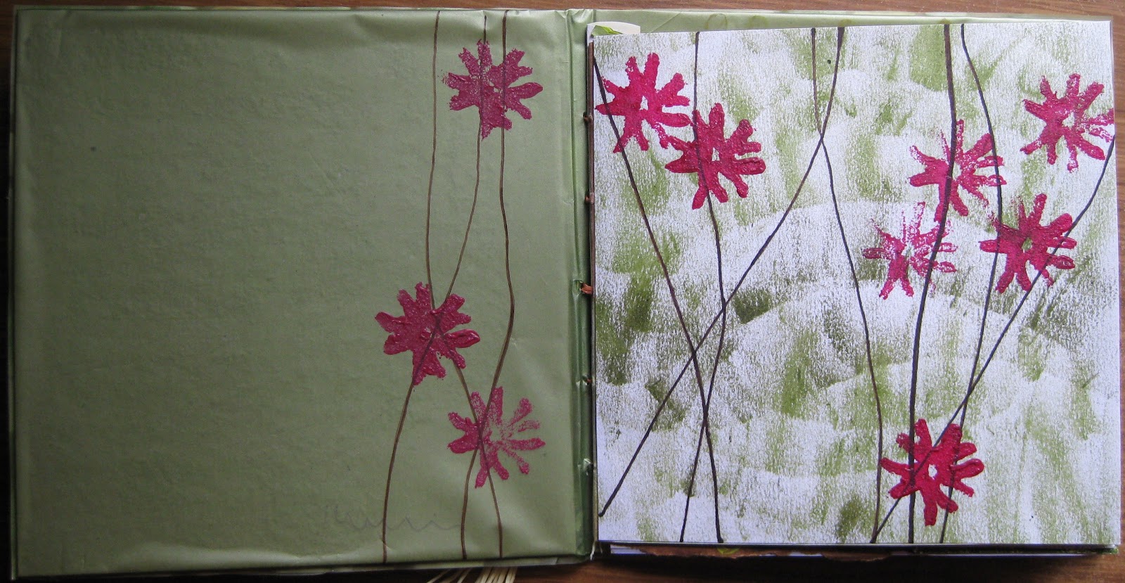
Weaving for the cover - lots of lines! and texture.  The tassels are made from paper string I found when I really wanted tracing paper.

I initially tried making the stamp for the campion from string but it just untwisted so I used felt and was very pleased with the results.

A simple first page, enlarging the ordnance survey map and tracing some of the lines to make a pattern.  Initially I was going to use a transparency but then a bunch of flowers arrived wrapped in just the ideal paper, flowery cellophane (and grotty green lutrador) The page immediately became more interesting.

Next to this I sewed a photo of the water with a pattern of the ripples the little coot chicks made in the water.  The lines all seem to carry on.  (I spent ages watching the chicks and took lots of photos of them swimming in the water, trying to capture their enormous feet on tiny bodies but none of them really worked)


Torn paper and string with acrylic motifs.  These pages took a long time but I'm happy with the result.  Perspective is all forgotten but I don't think that matters. The dale seemed an ideal topic for lines, the line of the river, the footpath, the walls and bridges, the steps leading up to the cottage where we stay.


Writing is lines so I've added some of the poems found along the path leading up to Middleton. Some are about the sheep found everywhere and the (now ruined) sheep wash.  Of course the dale is surrounded by hills. (The green used for the hills is actually the same all over, the light darkened the flap.)  The dipper just had to be included, they are such dear little birds but are hard to see except when they fly.


A watercolour of the dale, a bit of perspective this time.  Not sure about the pink bridges as they look more like bricks than the lovely grey, lichen covered walls but I wanted to stick to my colour scheme.  Lichen must be a topic for another time.  I joined the next page with a gusset, grading the colour from one page to the next, again the light doesn't show this.  I was hoping to create negative spaces between the trees, it's not as clearly defined as I'd hoped but Istill quite like the trees.

There are lots of trout in the river, (pike too) again, hard to spot.


My last page is a pattern of man made water controls.  They always make fantastic reflections and patterns.


Lots of photos to go through but I wanted to show how the pages interact.  Not that the interaction is as clever as I hoped but that would require a lot more time and practise.  A lovely module and a challenging end chapter.  Thank you Viv.

Sunday, 19 February 2012

M3 Ch8 String Prints extra

As soon I finished my blogging I realised I hadn't blogged everything.
This photo just shows my blocks.
3.8.1 I love 'The Earth From the Air' by Yann Arthus-Bertrand.  The first photo are lines fro his photos, the second photo is from a map of my local area, where I live now and where I used to live.


3.8.2 These photos are pages in my sketch book.  The first photo uses just one print block, the second 2 and is colour washed, a busy page but I'm quite pleased with it.

M3 Ch9 Extending the Page

For some reason I found it difficult to get into this chapter, maybe because I'm keen to think about my book, certainly not because it didn't appeal.
The first photo shows simple joins.  The luggage label was expanded by folding the edge of the white paper and sticking it on.  The plain white pages were joined using selotape.  I did have fun with the fish, positioning the paper fasteners so the fish could all be seen.

Using a hole punch and sewing appealed more.  The top left was joined with wire and the right one with raffia.  I took the luggage label idea for the bottom left.
Oh no, more doilleys!  I liked using the ribbon though.