I used this chapter as a means of getting back into the work after a long break. Having done the first activity I thought I had finished and started to blog only to discover I'd only done a quarter! So it took a long time to do it all.
A.6.5.1. Templates. Here are the templates I used, although I did find the simpler ones easier and found I was simplifying them as I went.
Both the leaves and wall seemed to suggest lines so that is why so many of my pictures turned out long. This is walnut ink background with soft pastels.
This one is ink based paints, lovely and bright.

I used a water colour background for the first picture and ink based paints for the second, not sure which I like best, it must depend on what next. I used thick acrylic for the stones. I like the different shades of grey better.
I still like my dandelion clock. I did make another picture with it, white crayon on black, overlapping the shapes but seem to have lost it. Rather like the pink though, Sharpie on water colour.
I like this too, water colour with Inktense veins. Couldn't decide on a background so didn't put one in, again think it depends on its use.
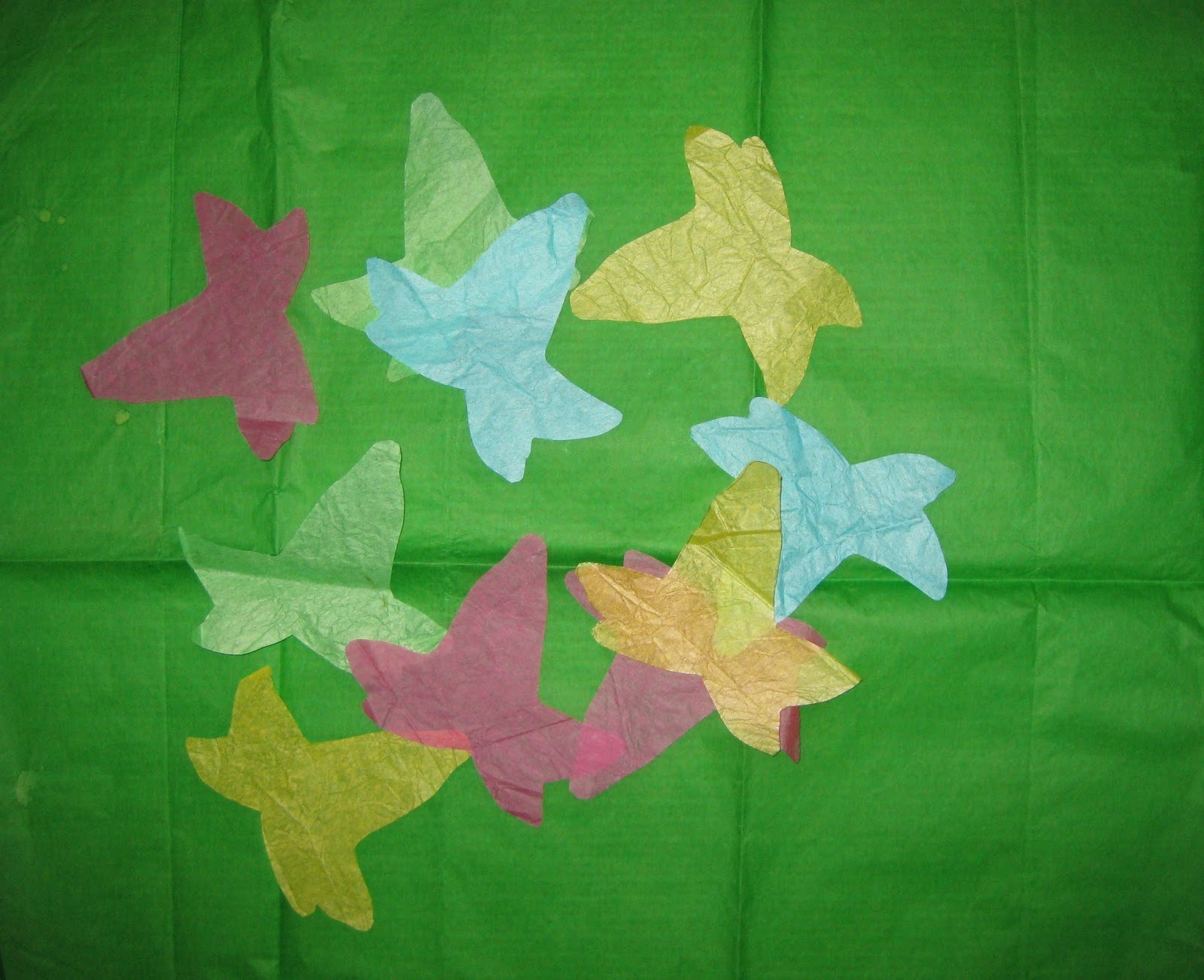
A.6.5.2. Cutouts. The first two are tissue paper arranged on khadi paper then acrylic wash.
For this picture I just dropped the tissues shapes onto a large piece of tissue paper to make a random pattern.
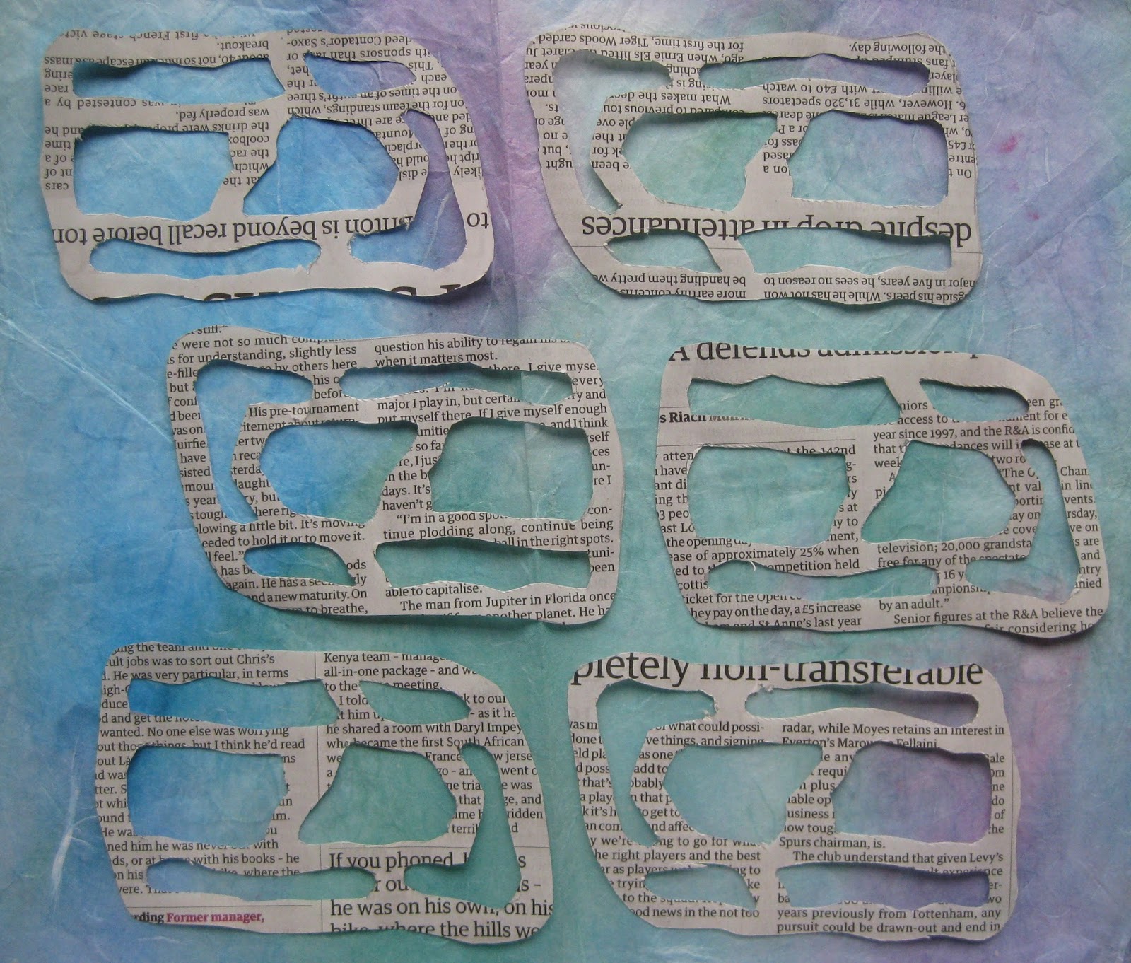
I liked the idea of newspaper for the wall. They worked better close together. The backgrounds look very pale compared with the real colours.

A.6.5.3. Using a grid. I first drew too small a grid so the leaf shape disappears.
These two are better and I like the irregular grid.
A.6.5.4. Transparent sheets. I chose the wrong motifs for this exercise so I'm not very happy with the results.
I felt the simpler shapes worked better, ie. the grass and leaves, so traced them separately and used them for moving on.
Because I traced them I used thin paper so decided to use pastels, then needed a background and used watercolour which messed up the paper! The first is just pen cut up followed by oil pastel. Then soft pastel and lastly coloured pencils. I like the last best, especially with the pen outline.