A5.6.1. Scrapbook. This could have gone on as I thought of different 'Changing Faces.' Photo 1 came from pictures, books and leaflets I had, and a mask bought from South Africa. Photo 2 is images downloaded from the Internet. Photos 3 and 4 were from a website, Masks from Around the World. This was a great website, my 4 year old grandson and I spent a happy hour looking at it which may have some bearing on the choice of images and the number!
A5.6.2. I chose 3 different masks to draw and, much as my natural inclination was to choose an African mask, I chose a Chinese opera mask to develop. I was attracted by the 'eye mask'. I also chose primary colours as best suited the graphic design, again not colours I would naturally choose - and certainly not to wear.
Last things first! My collection of pictures is different sizes so I chose to make a folder with different size pockets. The first 2 pictures show the inside and outside of the folder with pictures added.
Here are the 3 masks I chose, one Chinese, one Indian and one African. It was tempting to print the pictures and trace them but I resisted although I did then copy my drawings. The Chinese one proved most difficult as I got in a muddle with the swirls above the eyes, a coloured in version helped in subsequent pictures. Using felt tips was a lovely relaxing exercise.
Despite the smudges I liked the charcoal copy and spray stopped it getting worse.
Thought I'd try blue and yellow and swap the colours round. Yellow was like the original, blue seemed to like the black.
My favourite part was the 'mask' round the eyes so took this further, taking out the eyes so it was just a pattern and tried different colourways. I made a stencil to help here, drawing round the pattern. The black and white appealed so that was another development. Strangely, the off white paper stayed off white even when painted so I didn't bother. Acrylic paint worked best giving the boldest colour.
More stencils, three to show different lines of the mask but this time I sponged the paint directly through the stencil. The covers were made using one stencil on top of another,something I hadn't done before but it was easier than I expected and worked well. Then just white on black.
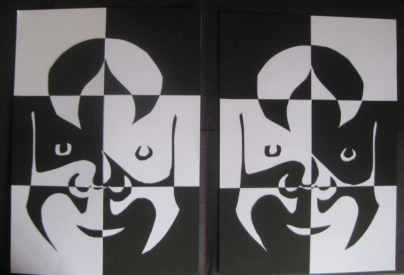
Using stencils again but this time to make paper cutouts, the white on black is my favourite.
Paper cutouts make two similar pictures so I chopped two to make a chequer board. from a distance the faces seem to disappear, leading on to another idea.
This time I sponge printed onto fabric using fabric paints and decided to liven them up with stitch. For the first one I used thick thread in the bobbin. (If this piece was for an exhibition I would need to check the tension more carefully. I quite like the bobbly effect but not mixed with the smoother bits!) For the second piece I used stitch to make the pieces become one again. I wasn't sure when I first stuck the bits back together but adding stitches made a big difference and I was pleased with the end result. I also learnt a couple of things - iron set one colour before adding the next as they will mix, being lazy and using a towel instead of getting out the ironing board will crinkle fabric when applying bondaweb.
.