Monday, 18 July 2011

M2 Ch 4 Take a letter

Shan't write much this time as I'm in the middle of moving and one job is to get this blog done.
Activity 2:4:1 gave a lot of scope to investigate pattern and using different colouring pens and paints.  I did like the way the green/grey echoed theoriginal lettertaken from a grave stone.  Shame I made the reddest/purple paint too dark on the purple colour.


Don't think my letter was the best for 2:4:2 but gave a bit of o challenge.  Tried chopping and resticking one grid which meant the shapes didn't match properly.  They would need redrawing to use for quilting.


Saturday, 2 July 2011

M2 Ch 3 Drawing with Glue

This proved trickier than expected as all the nozzles I found were too big.  I did try various things including writing directly from the bottle but in the end settled for using the end of a pippette as a dip pen.  It took a while but gave the neatest results. 
2:3:1This first picture shows my 2 efforts.  looking at them again, maybe neater isn't always better.

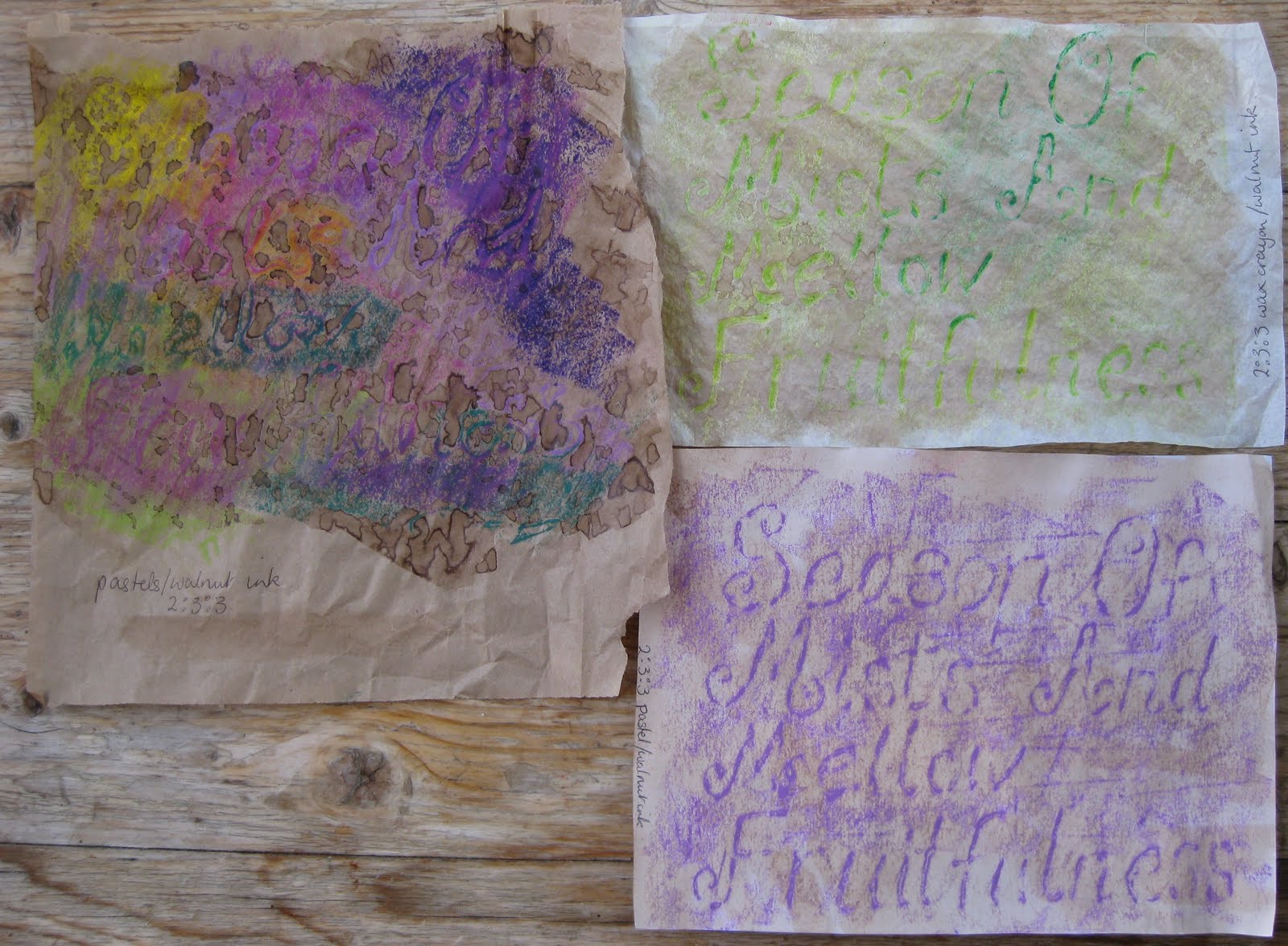
 2:3:2Trying wax crayons.  I do like tissue paper for so many things, also brown bags.  Plain white paper never seems so good.  I really like the way using 2 colours makes 2 lines very close to each other.
 My mistakes.  Trying pastels after the crayons I found you didn't need to press so hard.  Didn't like the paper much, either side (see above).  The kitchen towel was just too stretchy.
I got on better with the pastels after the first attempt and lots of tissue paper.

 I found the markel sticks needed lots of hard rubbing to get an image but rather liked the subtle results, it shows up better in different (dimmer) lights.  Only for special pieces as my finger nearly wore away!
 2:3:3 What a difference adding a wash made.  The last picture had layers of wash to get the colour I wanted.  I like the way the wash collected on the brown bag making lines round each drop.  I hoped for better from the grey on grey, although the added purple helps.
 The pastels took a much deeper coloured wash.  Initially the grey pastel was disappointing but the more I look at it the more it reminds me of Skye, a beautiful place.
 There's not a lot to say about the walnut ink wash!
 I liked the candle wax with wash but don't feel the wash added to the markel added anything.
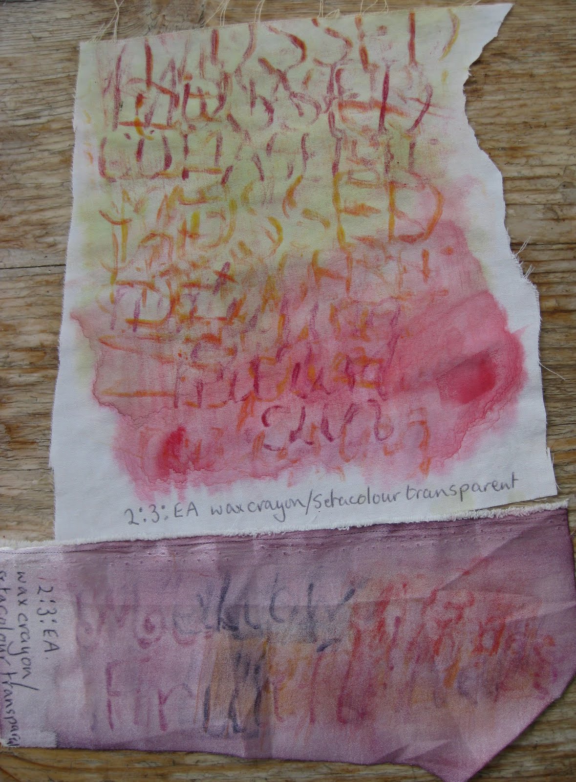
2:3:EA1   Adding walnut wash over the PVA didn't show the writing up at all so I added wax crayons.  The colour hardly shows at all but the PVA shows more, a subtle piece.  I couldn't decide whether to add another wash or not to the resist page so did half and half.  I'm glad I did as the writing becomes much fainter, I love the colours it all made though.  The water colour on PVA showed more than the walnut although I did need deeper colours to show against the brown background.
 2:3:EA2  Definitely some fabric worked better than others, some just wiggled about too much and I found the markel too disappointing.  My favourite is the top one done on a satiny fabric.
 I'm not sure the colour washes helped much, looking at them, maybe deeper coours would improve them.
The poem I chose for this meant I could experiment with lots of different colours but I do like the sludgey greens I so often come back to.  Also the purpley pinks.

Thursday, 23 June 2011

M2 Ch2 Handwriting

Here is the write up to go with the previous blog.

Not quite sure why I didn't make the charcoal page more exciting!
I like the black and white page better than the all black page which is very bland.  I was trying a new ink which was very pale and I need to experiment more to find out what it will show up on.
The other pages from activity 1 are fairly self explanatory, the one I find most pleasing is the one with candle wax, I could see using that as a background for further work.

The pages for activity 2 were done in remembrance of my sister-in-law who died very recently so I did them for her. I loved the pages in the 'morepork' page, a shame the 2 patterns in the top left are together.  Why do I always prefer the patterns I do that are curvy, as in the 2 coloured pages.

I liked writing round in a circle (activity 3)but was disappointed that the ones going round in a wonky shape soon returned to a circle, even on my second attempt when I deliberately tried to avoid that.

Spent yesterday showing my 5 year old granddaughter how to do the first page of activity 4.  Like most little girls, she's very into writing and loved it.  I was very pleased with how all my pages turned out, too!

Wednesday, 22 June 2011


This first page took me right back to year 4 at junior school when we were allowed to progress to a fountain pen once we had mastered a dip pen.  I loved hand writing lessons!
souffle and glaze pens with brusho paint wash, the real colours are much more vibrant.


Monday, 6 June 2011

M2 Ch1 Fantastic Fonts

2.1.1 Find fonts on your computer.  An easy exercise for me because of past experience so a good intro.  I can see the plain sheets as a particularly useful reference. I was disappointed that the tissue paper would go through my printer when firmly stuck to a backing sheet, masking tape just wouldn't do it.  I did like the picture backgrounds though.  The fushia was my photo printed on a draft setting first.


2.1.2 Topsy Turvy Printing.  The black ink over the blue (pale green background) is too heavy.  The blue/green stripey background was made using a new big fan-shaped brush. (I like it!)  The pink background is a mulberry silk paper.

2.1.3 Collecting words and letters.  Pages from my sketch book.


From my postcard collection.
2.1.4 Recycled papers.  Some pages from my collection - junk mail and envelopes, leaflets, recipe cards, envelopes inside and out, newspaper, bags, notes, assorted letters, computer printouts, maps, postcards.