This proved trickier than expected as all the nozzles I found were too big. I did try various things including writing directly from the bottle but in the end settled for using the end of a pippette as a dip pen. It took a while but gave the neatest results.
2:3:1This first picture shows my 2 efforts. looking at them again, maybe neater isn't always better.
2:3:2Trying wax crayons. I do like tissue paper for so many things, also brown bags. Plain white paper never seems so good. I really like the way using 2 colours makes 2 lines very close to each other.
My mistakes. Trying pastels after the crayons I found you didn't need to press so hard. Didn't like the paper much, either side (see above). The kitchen towel was just too stretchy.
I got on better with the pastels after the first attempt and lots of tissue paper.
I found the markel sticks needed lots of hard rubbing to get an image but rather liked the subtle results, it shows up better in different (dimmer) lights. Only for special pieces as my finger nearly wore away!
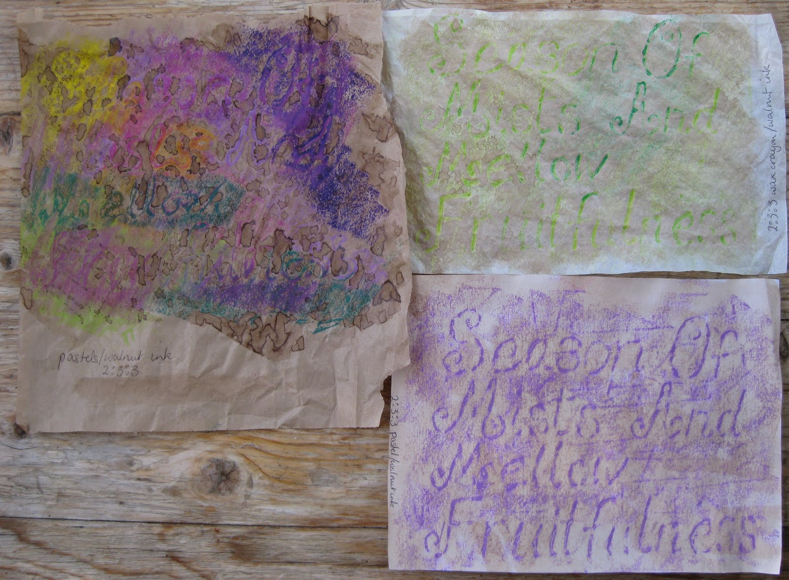
2:3:3 What a difference adding a wash made. The last picture had layers of wash to get the colour I wanted. I like the way the wash collected on the brown bag making lines round each drop. I hoped for better from the grey on grey, although the added purple helps.
The pastels took a much deeper coloured wash. Initially the grey pastel was disappointing but the more I look at it the more it reminds me of Skye, a beautiful place.
There's not a lot to say about the walnut ink wash!
I liked the candle wax with wash but don't feel the wash added to the markel added anything.
2:3:EA1 Adding walnut wash over the PVA didn't show the writing up at all so I added wax crayons. The colour hardly shows at all but the PVA shows more, a subtle piece. I couldn't decide whether to add another wash or not to the resist page so did half and half. I'm glad I did as the writing becomes much fainter, I love the colours it all made though. The water colour on PVA showed more than the walnut although I did need deeper colours to show against the brown background.
2:3:EA2 Definitely some fabric worked better than others, some just wiggled about too much and I found the markel too disappointing. My favourite is the top one done on a satiny fabric.
I'm not sure the colour washes helped much, looking at them, maybe deeper coours would improve them.
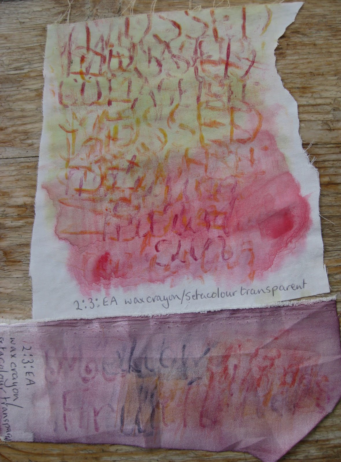
The poem I chose for this meant I could experiment with lots of different colours but I do like the sludgey greens I so often come back to. Also the purpley pinks.